Digital Type and Color was one of the more interesting classes I had for this program, it taught me a lot more about Color Theory as a whole and just how to make some colors mesh together in new and unique ways.
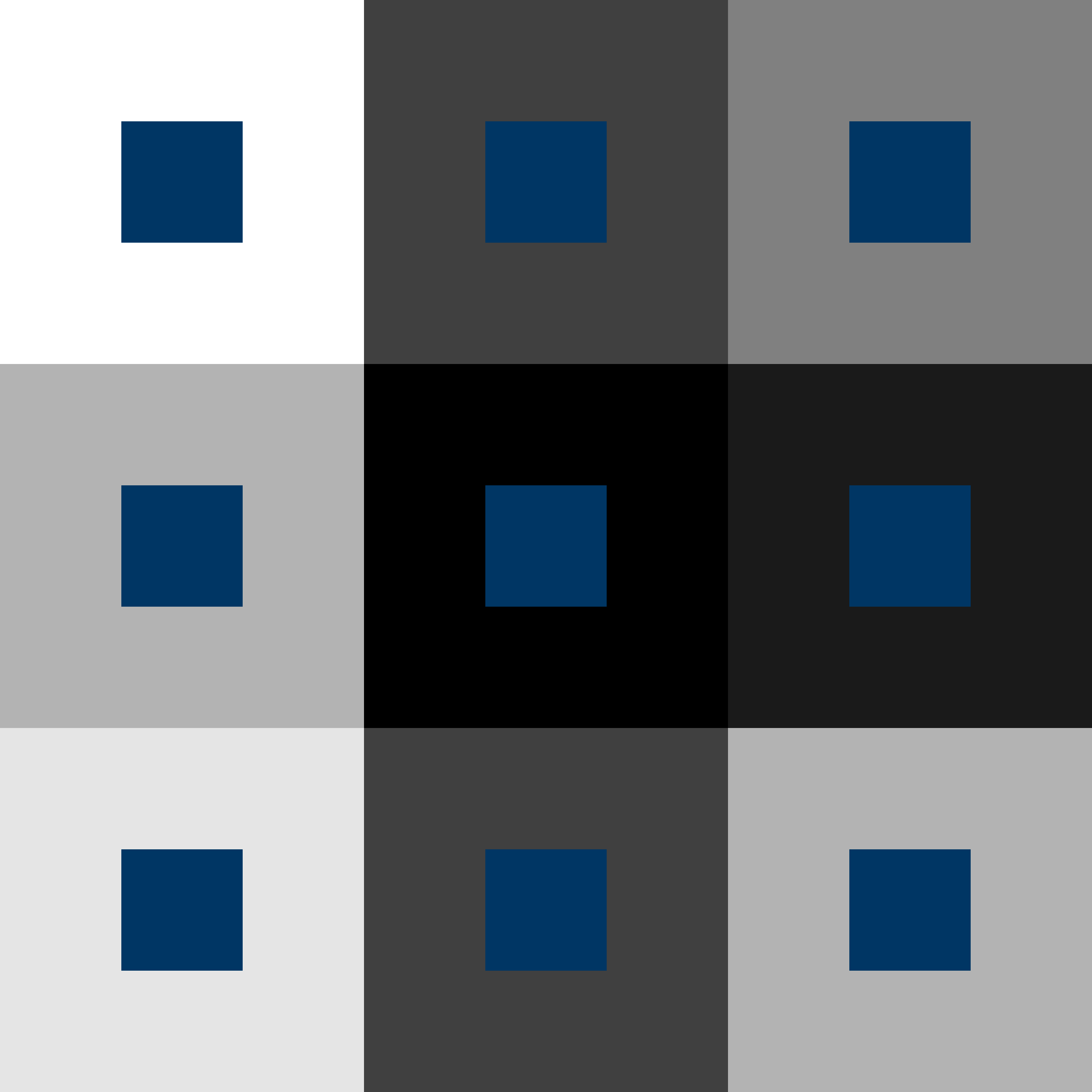
Looking at these projects I did was one of the steppign stones for it, making the boxes by picking a single color and then finding other colors to work with and aaisnt it was a fun idea and then making it Monochromatic to
show the layer of depth it feels like they have was a joy to see in motion. I felt great about it all, happy I pikced a more consise color that helped give that impression of it all.
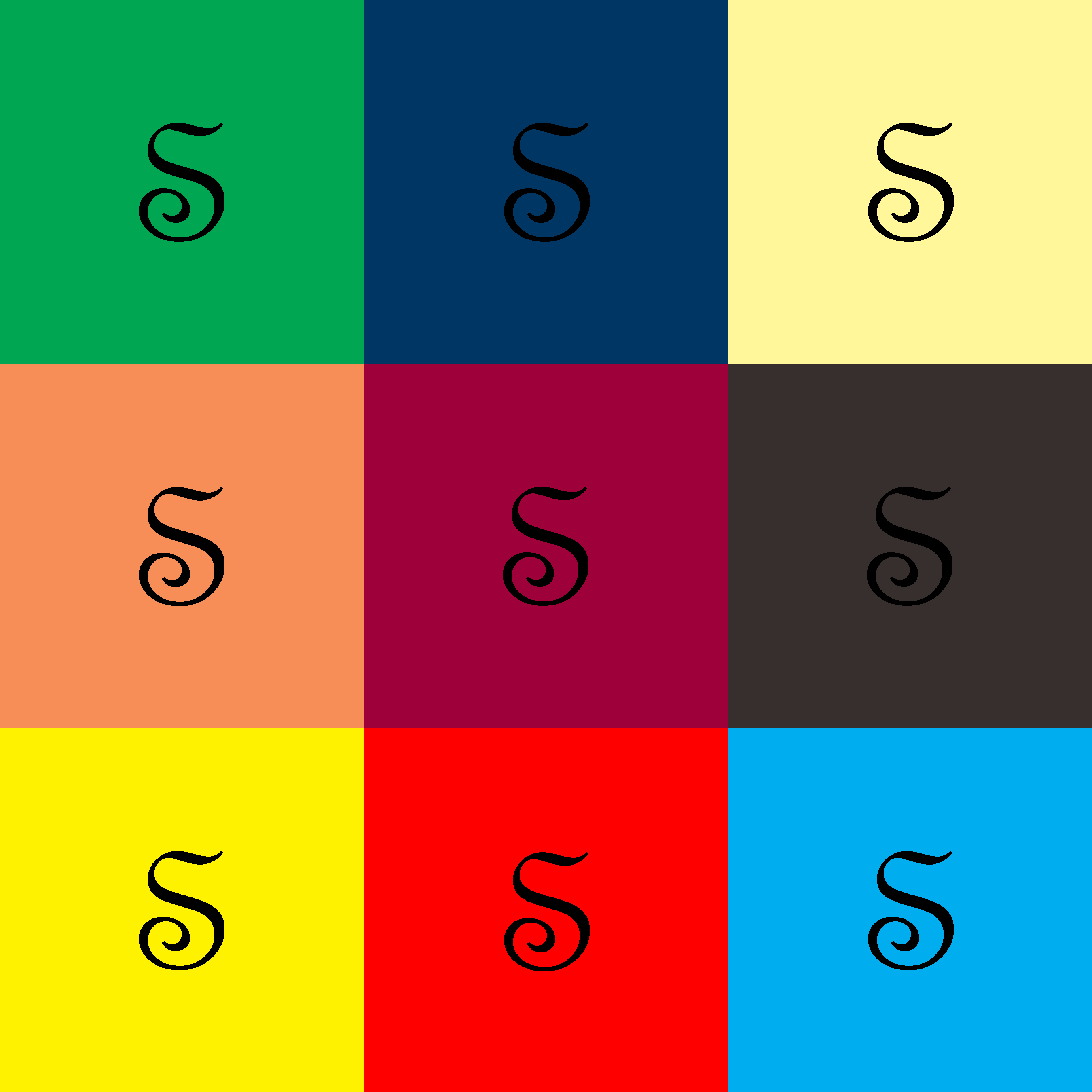
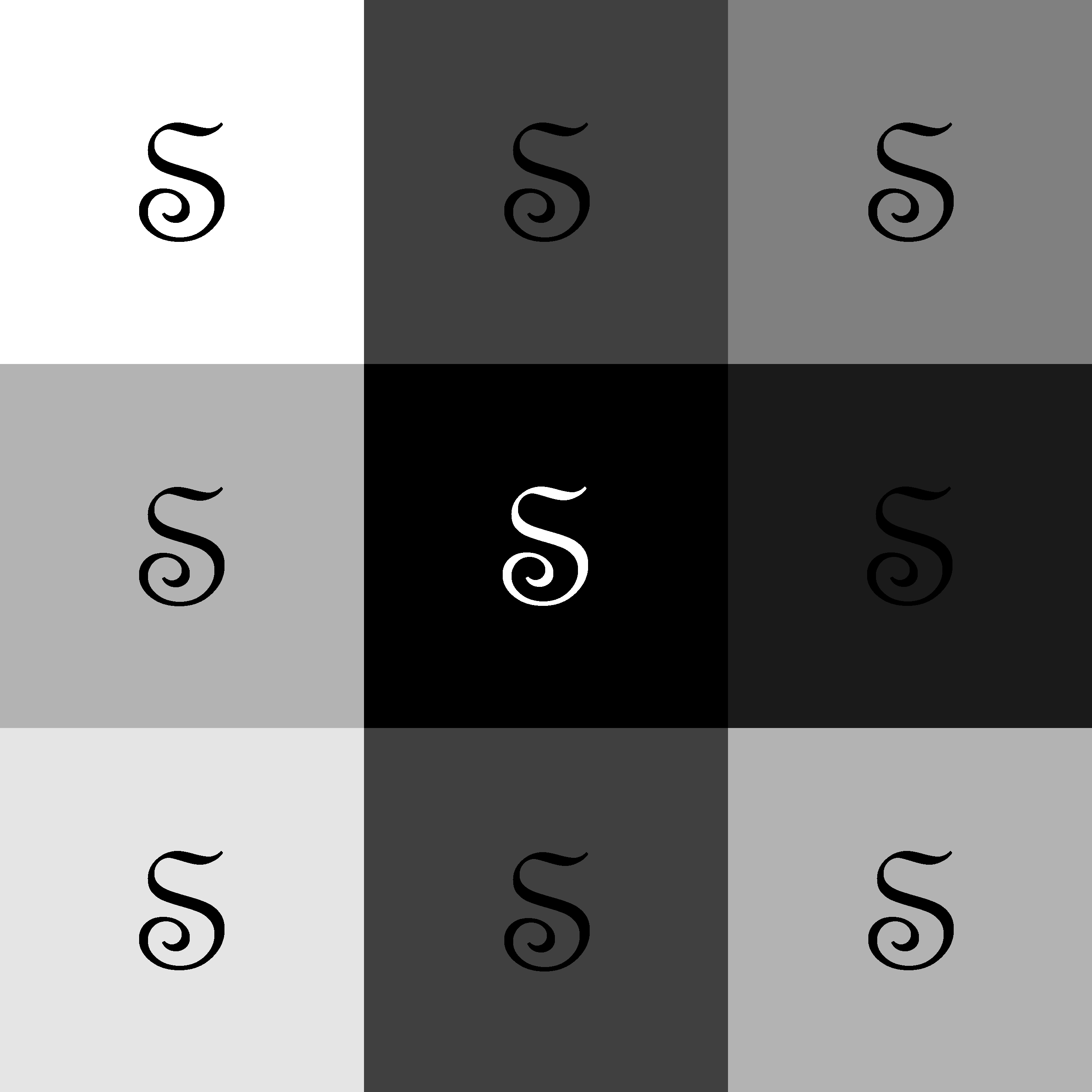
Along with the colored boxes we were tasked in making a similar collage but with a letter of our choice in a font of our choice as well. As shown I decided to go for a regal looking S for my piece and was used for
contrast along the Monochromic suqares for this one, showing that the pure black had ot be turned white and how it blended with the greys all around it. Ontop of how legible it is ontop of certain colors, while it was simpler
I did take a while picking a letter I wanted but happy with how it all turned out. This is one of my favorites just due to the vibrancey of it all and how color theory really goes into work to show how it blends.
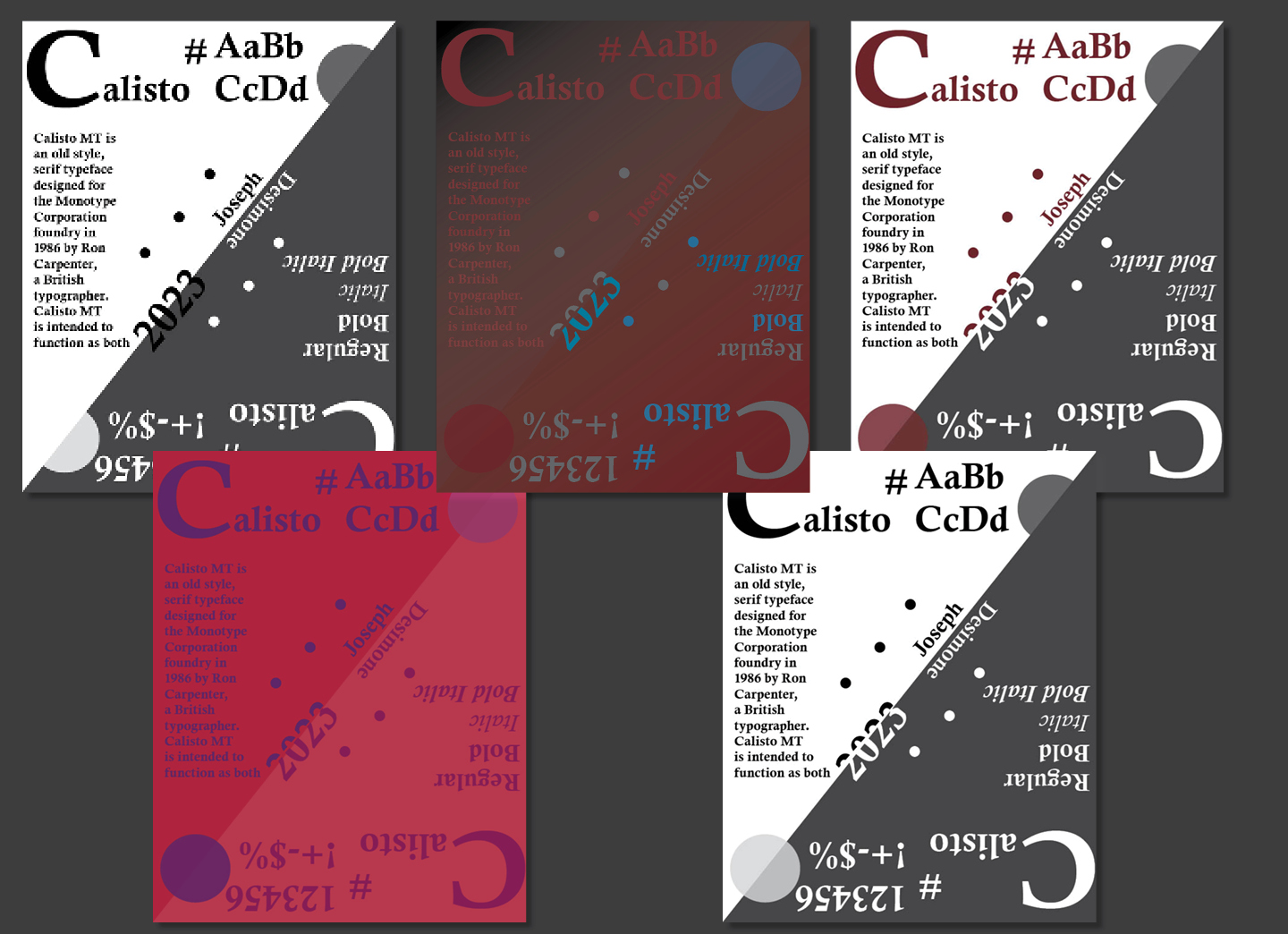
One of our last assignements was to create a poster featuring a certain Font of our choice. As seen I picked Calisto and got to work on it. This was a grand assignemtn to work on and really had us showcase out skills in this area
with proper space and blocking for every single piece we added to it. Trying to fit in the criteria that we were assigned and making it legible instead of a cluster of a mess to look at. Making it try and look symmetrical yet
isn't fully. Having the same weight on each side on each corner and area, making it all work in some harmony was a great challenge for it all. Then ontop making it different colors to see how it all played together in a new
way instead of just black and white. Having to make it all balance naturally and look pleasing (for the most part) to the eyes for what could actually be a nice type poster in a room of some sort, all in all was just a great
puzzle to work on and solve in an artistic sense and proud of what I was able to accomplish in it all.